工程师为什么离不开 Linear:一个设计师的诚实拉片
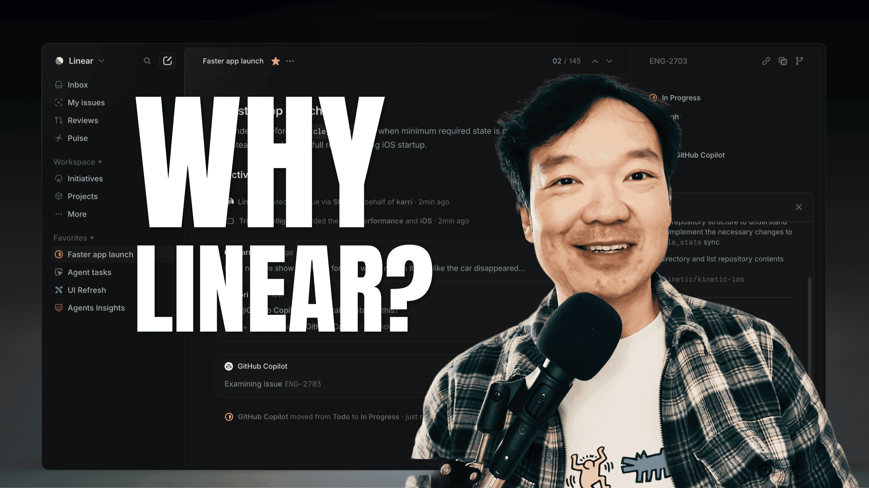
PM 工具一抓一大把:Notion、Jira、Asana、ClickUp、Monday、Trello,挑个颜色都能找到一款。但为什么工程师一旦用过 Linear,就不愿意回去?
我做了十六年设计,几乎所有这些工具我都用过,作为真实用户而非测评博主。所以当一个工程师朋友说"我回不去 Jira 了"的时候,我没顺着点头,而是花了二十五分钟坐下来,对 Linear 做一次完整的产品拉片:冷启动注册、走完全部 onboarding、第一屏分析,然后再补了一段产品 funnel 和定价的 desk research。
三个模式反复出现。它们都不是营销话术里说的"快"或"极简"。它们是一组关于"产品如何尊重用户注意力"的设计决定。
1.「3 项规则」是合同,不是风格
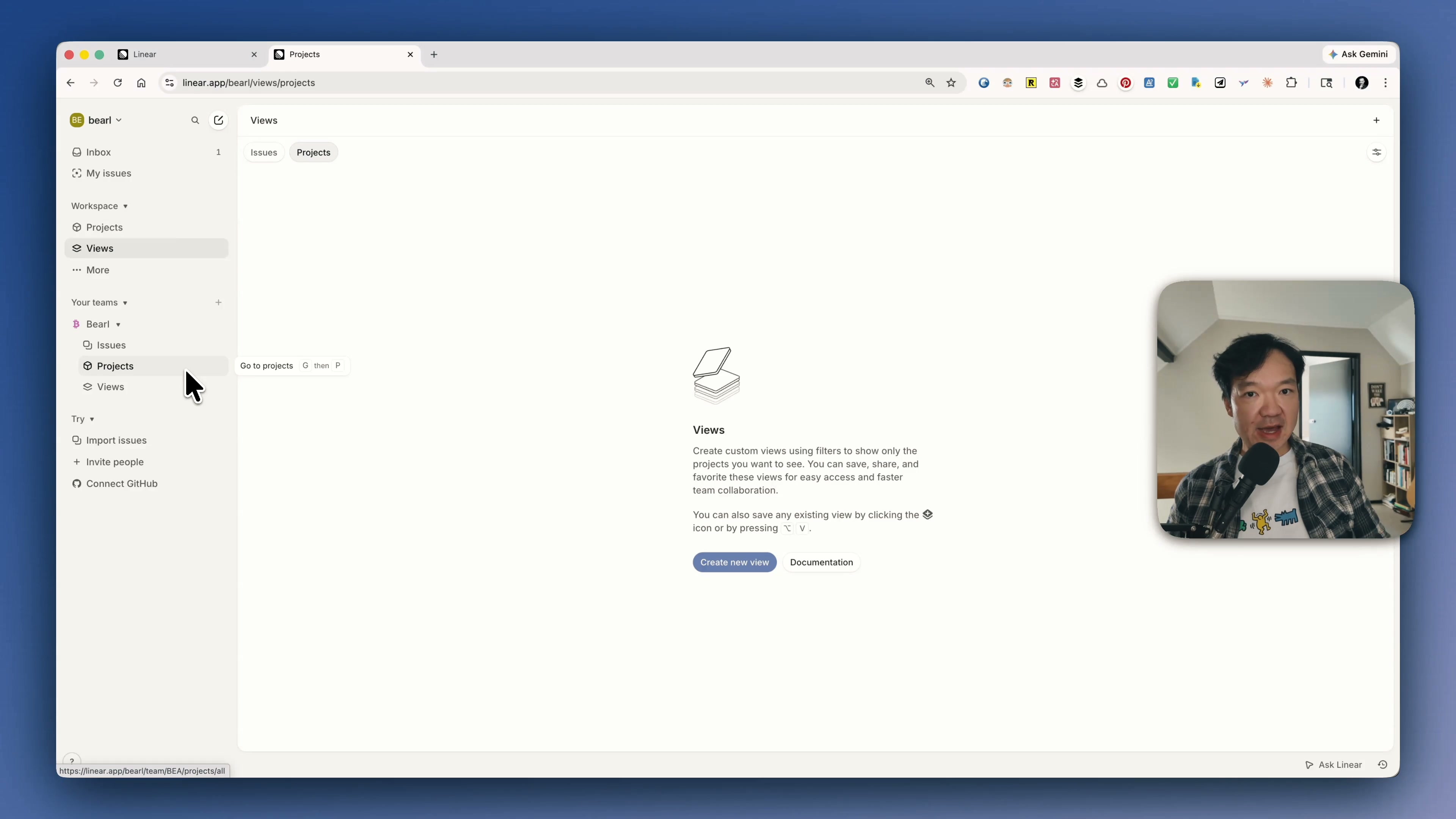
进到工作区第一眼就发现:几乎每个 UI 容器都把可见项数压在三个以内。个人团队面板:issues、projects、views 三项。上面的 workspace section:三项可见,多余的折成"更多"。issue 列表右上角:filter、display、open details 三项。连 onboarding 本身也只有七步,那是工作记忆开始衰退之前的上限。
这不是装饰。这是一份显式的认知负载合同。当每个容器最多只有三项的时候,你不需要在开始工作之前先分配注意力。看一眼、做选择、动起来。产品替你完成了优先级判断,而不是把这件事甩给用户。
第十一第十二个东西被折进"更多",不是设计失败,是 ICP 筛选。如果你的工作流要求你的侧边栏永远能看到十二个项目,Linear 在很温和地告诉你——它不是为你设计的。
2. 把键盘快捷键放进 hover tooltip:这是一笔留存账
第二个模式小到第一眼会错过。把鼠标 hover 在 Linear 任何一个 UI 元素上——导航、按钮、issue 的属性——tooltip 里都会同时给出文字标签和键盘快捷键。
Notion 有快捷键,Asana 也有快捷键。区别不在"有没有",在"怎么暴露"。Notion 的快捷键你需要去翻 help page 才能学会;Linear 的快捷键你在用产品的时候自然就遇到了,因为产品永远不让你忘记它。
为什么这件事对公司而言重要,不只对用户重要?因为快捷键会把一个"熟悉产品的人"升级成"被产品的肌肉记忆绑定的人"。离开成本从几周的再培训,变成几个月的肌肉重塑。这不是 UX 打磨,这是把切换成本工程化,包装成了一个 tooltip。
这里还有一个市场契合度的信号:工程师爱键盘。设计师、PM 也用,但不像工程师那样把它当生产力主轴。Linear 把最重的 UX 投入压在工程师最在意的肌肉上——产品不仅仅匹配市场,它在主动追求市场。
3. 桌面 + 文件夹:分层 UI 范式
第三个模式我花了最久才说清楚。在产品里待十五分钟之后,我注意到 Linear 的 UI 分层和别人不一样。
左侧栏——workspace、teams、projects、issues、views——永远不动。它是固定面。叫它桌面。右侧——issue 列表、issue 详情、按下去之后召唤出来的 AI 对话框——是漂浮在桌面之上的卡片。叫它白纸。
对比一下 Jira。Jira 有顶部菜单、有左侧栏、有主区域,但它们都在同一个平面上。没有深度,没有"我现在在桌面、这是我手里的纸"的层级感。再对比 Notion:页面无限嵌套,外壳和内容融在一起,你分不清边界从哪里开始到哪里结束。Asana 离 Linear 最近,但没有把这个范式做得那么硬。
Linear 对桌面+白纸分层的硬执行,是工程师感觉它"心流"、PM 感觉它"束手"的根本原因。工程师习惯一次进入一个深度上下文,所以"稳定全局面 + 易变操作面"刚好是他们工作日的形状。PM 经常需要横跨多个 context 做切换,所以同样的范式对非目标用户来说会显得限制。
Linear 顺手回答的两个生意问题
这三个模式拼起来之后,两个生意层的决定就讲得通了。
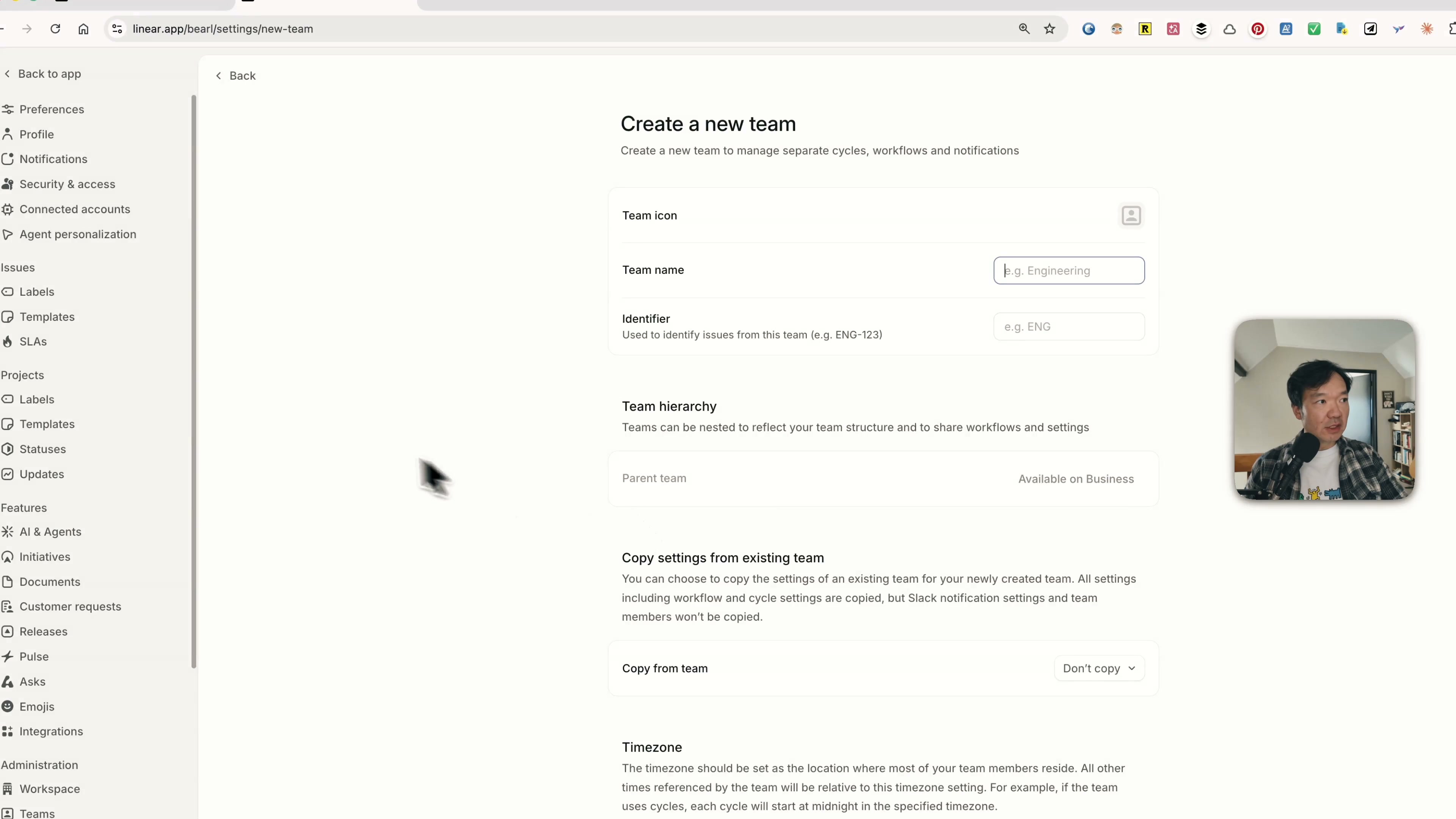
为什么 Cycle 藏在 settings 里? Cycle 是 Linear 给 sprint 起的名字。我看过的所有外部文章都把 Cycle 当作核心功能。但默认是关的——你必须在 workspace settings 里手动打开。我找了五分钟没找到,最后是去翻文档才确认在哪。
这不是 UX bug,是 ICP 筛选。一个不在用 cycle 思考的团队,进入到敏捷工具流的下一步会很尴尬。强迫用户主动启用 Cycle,等于在说"如果你说不清楚为什么需要它,那它后面的整套敏捷机制对你也没意义"。按需暴露好过默认覆盖每一个新账号。
为什么 PLG 漏斗这么陡? Linear 的响应时间小于 15 毫秒,比 Jira 快 3 倍,比 Asana 快 2 倍。营销话术押在"快"上。但漏斗数据更有意思:约 65% 的付费客户来自自服务的免费用户。路径很稳定:工程师个人发现 Linear → 带进自己的团队 → 团队开始嵌入工作流 → 公司变成默认 → 签 enterprise 合同。
这条漏斗如果没有上面三个设计决定,跑不起来。工程师愿意自发上车,是因为键盘故事讲到他们心里;团队留下来,是因为"3 项规则"把整个面的认知负载都拉低;公司没法迁走,是因为桌面+白纸的分层已经长成了肌肉记忆,迁移成本是按月计算的,不是按功能。
如果是我做产品,会带走什么
三件可以应用到任何产品的事:
数一下每个 UI 容器有多少项。 但凡超过三个,问自己是不是在让用户替你做优先级。
让每一个可点击元素同时承担教学职能。 Tooltip、hover、command palette,它们应该在教用户下一步怎么操作,而不是只标注当前是什么。
把稳定的全局导航和易变的工作内容分到两层。 如果它们在同一个平面上,认知负载就会转嫁给用户。
Linear 的护城河不是"快"也不是"极简"。它是用三条具体的设计合同尊重了用户的注意力,然后再把这套合同长出来的肌肉记忆变成订阅收入。复制这件事比抄一套配色难得多。
接下来我会继续观察 Linear 的 AI 集成。今天的对话框还停在 ChatGPT 风格的浮动窗。如果 Linear 把 agent 像当年把键盘快捷键嵌进 tooltip 那样嵌进 issue 的生命周期,那才会是同一套打法的下一层。
完整拉片视频:https://www.youtube.com/@Bearliu
Why Engineers Love Linear (And Hate Going Back to Jira): A Designer's Honest Teardown
There are a lot of project management tools. Notion, Jira, Asana, ClickUp, Monday, Trello — pick a colour, you'll find one. So why does Linear keep showing up as the one engineers refuse to leave?
I'm a designer with sixteen years in the trade. I have used most of these tools as a real user, not as a reviewer. So instead of nodding along when an engineer told me "I can't go back to Jira", I sat down for twenty-five minutes and ran an actual product teardown on Linear: cold sign-up, full onboarding, first-screen analysis, then a follow-up research dive on the funnel and the pricing.
Three patterns kept showing up. None of them are about speed or "minimalism" in the way the marketing copy frames it. They're decisions about how a product respects a user's attention.
1. The "rule of 3" is a contract, not a style choice
The first thing I noticed once I was inside the workspace: every UI container caps at three items. The personal team panel: issues, projects, views — three. The workspace section above it: three visible items, anything more collapsed under "more". Filter, display, open details on the top right of the issue view: three. Even the onboarding flow itself stops at seven steps, which is the upper bound of working memory before recall starts to fail.
This isn't decorative. It's an explicit cognitive load contract. When every container shows at most three things, you don't have to ration attention before you start working. You glance, you commit, you move. The product is doing the prioritisation work that other tools push onto the user.
The fact that the eleventh and twelfth items in any section get collapsed into "more" is not a design defeat. It's an ICP filter. If your workflow needs twelve things in your sidebar, Linear is gently telling you it isn't the tool for you.
2. Keyboard shortcuts as hover tooltips: a retention play
The second pattern is small enough to miss on a first look. Hover any item in Linear's UI — the navigation, the buttons, the issue properties — and the tooltip shows you both a label and a keyboard shortcut.
Notion has shortcuts. Asana has shortcuts. Plenty of tools have shortcuts. The difference is exposure. In Notion you discover shortcuts by reading a help page. In Linear you discover them by using the product, because the product never stops mentioning them.
Why does this matter for the company, not just the user? Because shortcuts turn a user from "familiar with the product" into "muscle-memory bound to the product." The cost of leaving moves from a few weeks of retraining to several months. That's not UX polish. That's switching cost engineering, dressed up as a tooltip.
There is also a market fit signal here. Engineers love keyboards. Designers and PMs use them too, but not the way engineers do. Linear's heaviest UX investment is precisely in the muscle that engineers value most. The product doesn't just match its market; it courts it.
3. Desktop and folder: the layered UI metaphor
The third pattern took me longest to articulate. After I'd been in the product for ten or fifteen minutes, I noticed something different about how Linear's UI is layered.
The left panel — workspace, teams, projects, issues, views — never moves. It's a fixed surface. Call it the desk. The right side — the issue list, the issue detail, the AI dialogue when you summon it — is a card that floats above the desk. Call it the paper.
Compare with Jira. Jira has a top menu and a left rail and a main area, but they all live on the same plane. There's no depth, no sense of "I'm on the desk, this is the paper I'm holding." Compare with Notion: pages nest infinitely, and the chrome melts into the content. You can't tell where the surface ends and the workspace begins. Asana sits closer to Linear, but doesn't commit as hard to the metaphor.
Linear's commitment to the desk-and-paper layering is what makes the product feel like flow for engineers and chaos for some PMs. Engineers tend to work in one deep context at a time, so a stable global surface plus a mutable working surface is exactly the shape of their day. PMs tend to switch contexts often and need lateral navigation, which is why the same metaphor can feel restrictive when you're not the target user.
The two questions Linear quietly answers
Once those three patterns clicked, two business decisions made more sense.
Why is Cycle hidden in settings? Cycle is Linear's term for what most teams call a sprint. Every external article I read about Linear treats Cycle as core. But it's off by default — you have to enable it in workspace settings. I spent five minutes looking for it before I gave up and went to the documentation.
This isn't a UX bug. It's an ICP filter again. Teams that don't think in cycles aren't a good fit for what comes next. Forcing the user to enable Cycle is a way of saying: if you can't articulate why you need this, the rest of the agile machinery isn't going to land. Better to surface it on demand than to drop it on every new account.
Why is the PLG funnel so steep? Linear's response time is under fifteen milliseconds, three times faster than Jira and twice as fast as Asana. That speed is what the marketing leans on. But the funnel data is more interesting. Roughly sixty-five percent of paying customers start as self-serve free users. The pattern is reliable: an engineer finds Linear personally, brings it to their team, the team becomes embedded in the workflow, the company standardises, the enterprise contract gets signed.
This funnel isn't possible without the three design decisions above. Engineers adopt because the keyboard story fits them. The team stays because the rule of 3 keeps cognitive load low across the surface. The company can't migrate away because the desk-and-paper layering is now muscle memory, and switching costs are paid in months, not features.
What I'd take away if I were designing my own product
If you build software, three things to test on whatever you ship:
Count items per UI container. Anywhere you exceed three, ask whether you're forcing the user to ration attention.
Make every actionable element double as a teaching surface. Tooltips, hover states, command palettes — they should be teaching the next interaction, not just labelling the current one.
Separate stable global navigation from mutable working content. If they live on the same plane, your users will pay the cognitive cost of telling them apart.
Linear's moat isn't "fast" and isn't "minimal". It's that the product respects a user's attention with three concrete design contracts, and then it monetises the muscle memory those contracts produce. That's a harder thing to copy than a colour palette.
I'll keep watching Linear's AI integration story — the chat dialogue today is still the basic ChatGPT-style floating box. I'd want to see them embed agents into the issue lifecycle the same way they embedded keyboard shortcuts into the tooltips. Same playbook, new layer.
Watch the full walkthrough on YouTube: https://www.youtube.com/@Bearliu